Fox News Flash top headlines for March 17
Fox News Flash top headlines are here. Check out what's clicking on Foxnews.com.
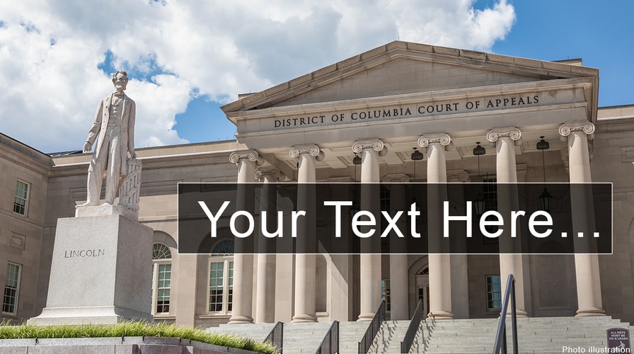
Word nerds be warned – when filing briefs in the U.S. Court of Appeals for the District of Columbia Circuit, don’t type in the centuries-old Garamond font.
Court clerk Mark J. Langer told lawyers this week that the court will now officially "discourage use of Garamond," arguing that it’s harder to read than popular alternatives.
"Briefs that use Garamond as the typeface can be more difficult to read and the use of this typeface is discouraged," he wrote in a notice released Tuesday.

Court rules require that typeface be at least 14-point and that it must include serifs, the little wings in some fonts. (Times New Roman is a serif font, for example, while Arial is not.)
But now under the new guidance aimed at making reading documents easier, the court clerk is encouraging briefs to be filed in Century and Times New Roman – and explicitly not Garamond.
"The court has determined that certain typefaces, such as Century and Times New Roman, are more legible than others, particularly Garamond, which appears smaller than the other two typefaces," Langer wrote.
The circuit also officially revised its handbook on internal practices to include the update.
The typeface was created in the 1500s by French engraver Claude Garamond – and versions of it have been widely used ever since, including in the widely accessible Harry Potter series. Book Riot, a pro-reading website, even ranked it "the best font for books" in late December.
And it is popular among lawyers.
"It's the only one I use," one attorney told Fox News. "It looks nicer than Times New Roman."
But the type most seen on computers dates back to the 1920s – and it is inferior to newer fonts designed with computer screens in mind, according to David Kadavy, an author and web designer.
"Amongst designers – especially print designers – Garamond is considered one of the best fonts in existence," he wrote in an undated blog post. "It’s timeless, and very readable. But, because of the limitations of current display technologies, it’s not a good font to use in web copy."
CLICK HERE TO GET THE FOX NEWS APP
He argued that certain fonts, like Times New Roman and Arial, scale up and down on computer screens much more efficiently and clearly, while others can pixelate badly when zoomed in or out.
"Even great classics like Garamond can be a disaster on the web," he wrote. "So it’s better to use a modern font that has been drawn with the screen in mind."
That could be an issue in electronically filed documents as well -- as courts continue to conduct business remotely amid the coronavirus pandemic.

The hottest stories ripped from the headlines, from crime to courts, legal and scandal.